Wayside Magazine
Brand Development | Layout Design | Photography | Web DesignA quarterly travel magazine for off-the-road and underrated places, focused on the essence of a place—captured via essays and recommendations from locals and photography essays. This was designed in my MCAD MAGWD typography course.
Brand Voice
An irreverent, sincere and authentic tilt, with a dash of the design-forward personality and perspective.
Design Scope
Research, concept, nameplate, and design template including cover, table of contents, and a feature article.
Audience
Wayside appeals to folks who travel to live like locals and are interested in hidden gems, hanging out at the local cafe, and getting to know the people who live in a place.
Inspiration & Visual Direction
Adventurous and curious, embodied by bold, editorial photography; modern, slightly quirky typefaces; textural cover photos; and contemporary, contrasting color palettes.
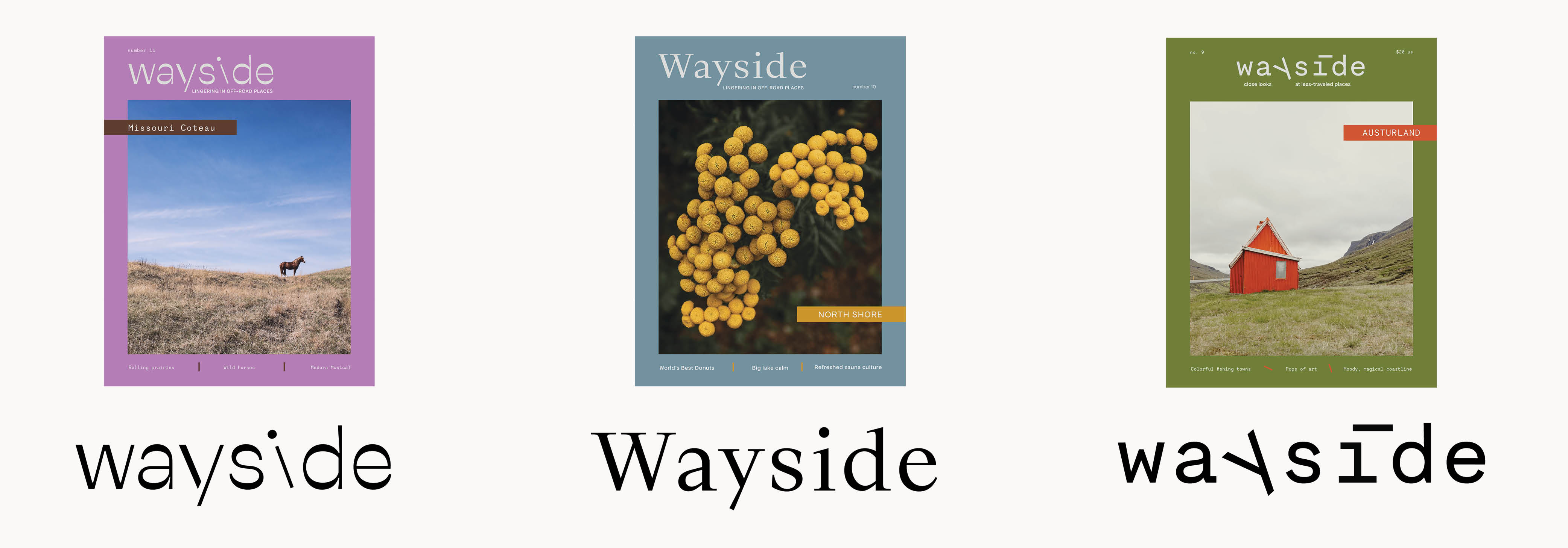
Nameplate Iterations
I explored a more quirky and adventurous directions vs. something more elegant and classic. I also wanted an option with enough contrast to stand out on a rack.
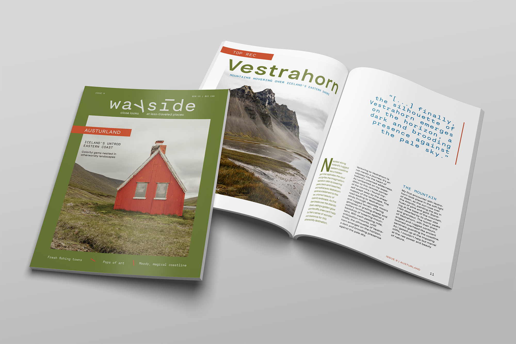
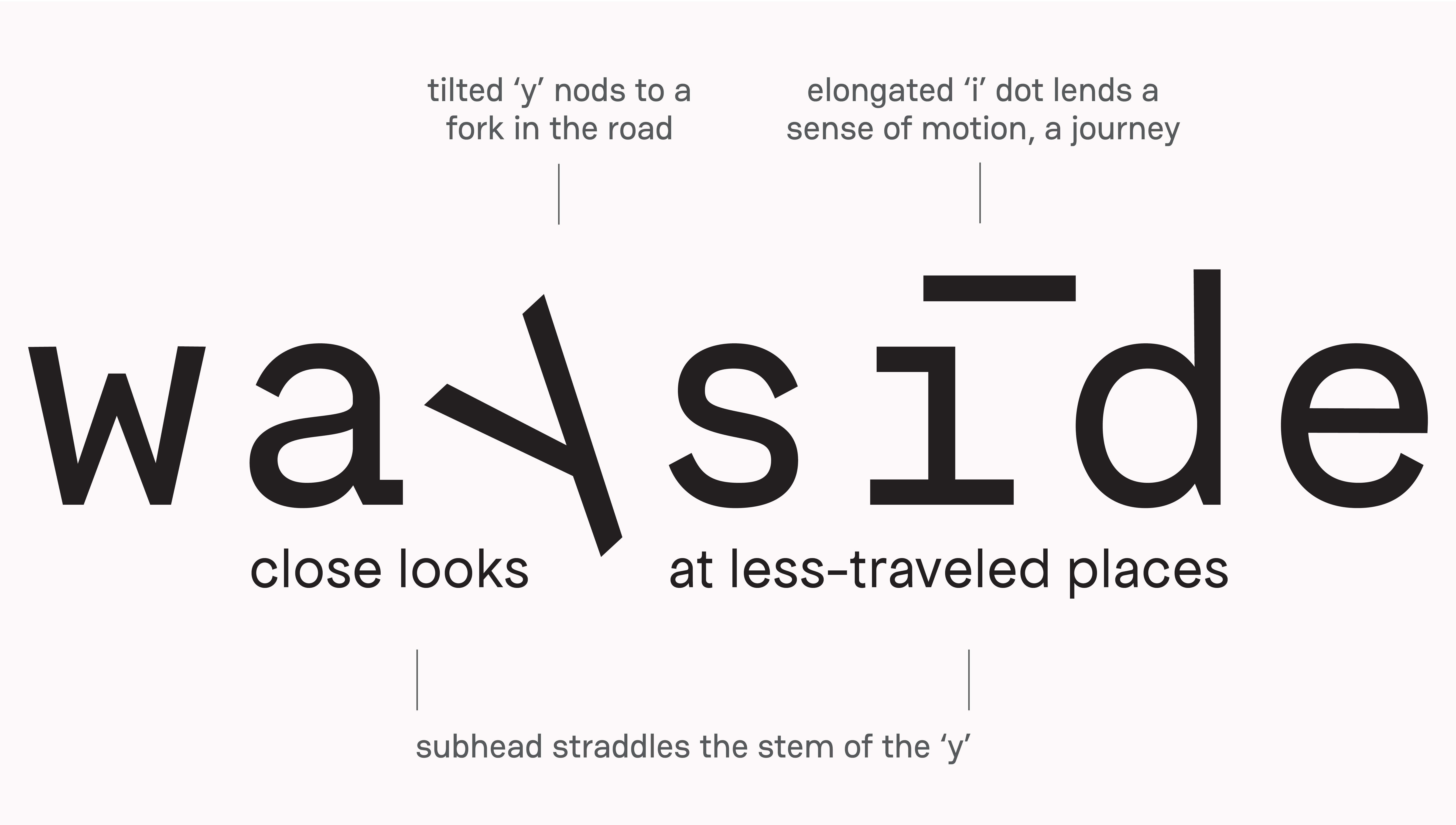
Final Nameplate & Typefaces
The final nameplate is derived from Necto Mono, designed by Marco Condello. The subhead is in the other brand font, Apfel Grotesk.
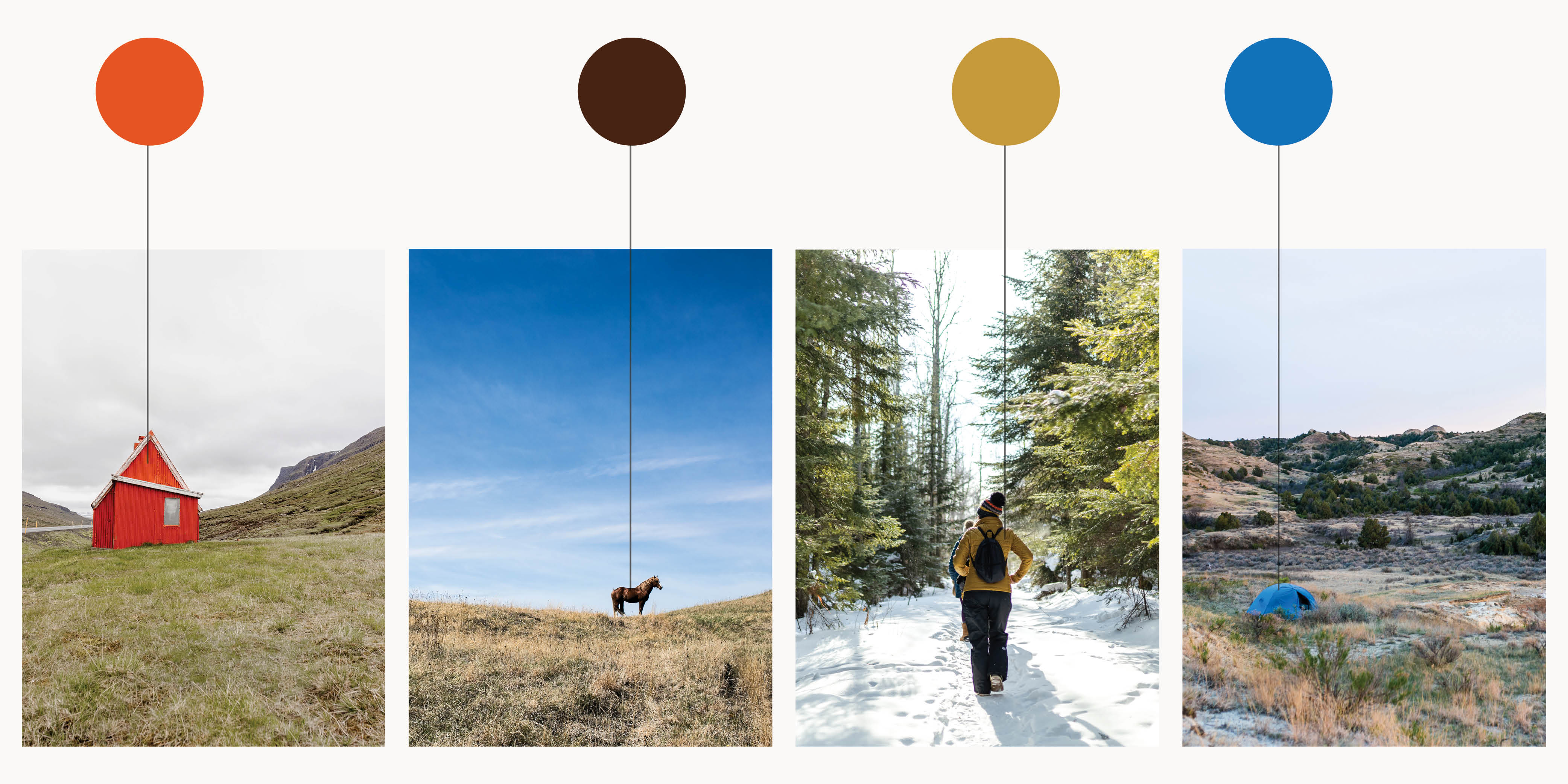
Color Approach
Each issue has a simple, bold color palette: An accent color pulled from the cover image and a primary contrasting color, which surrounds the cover image.
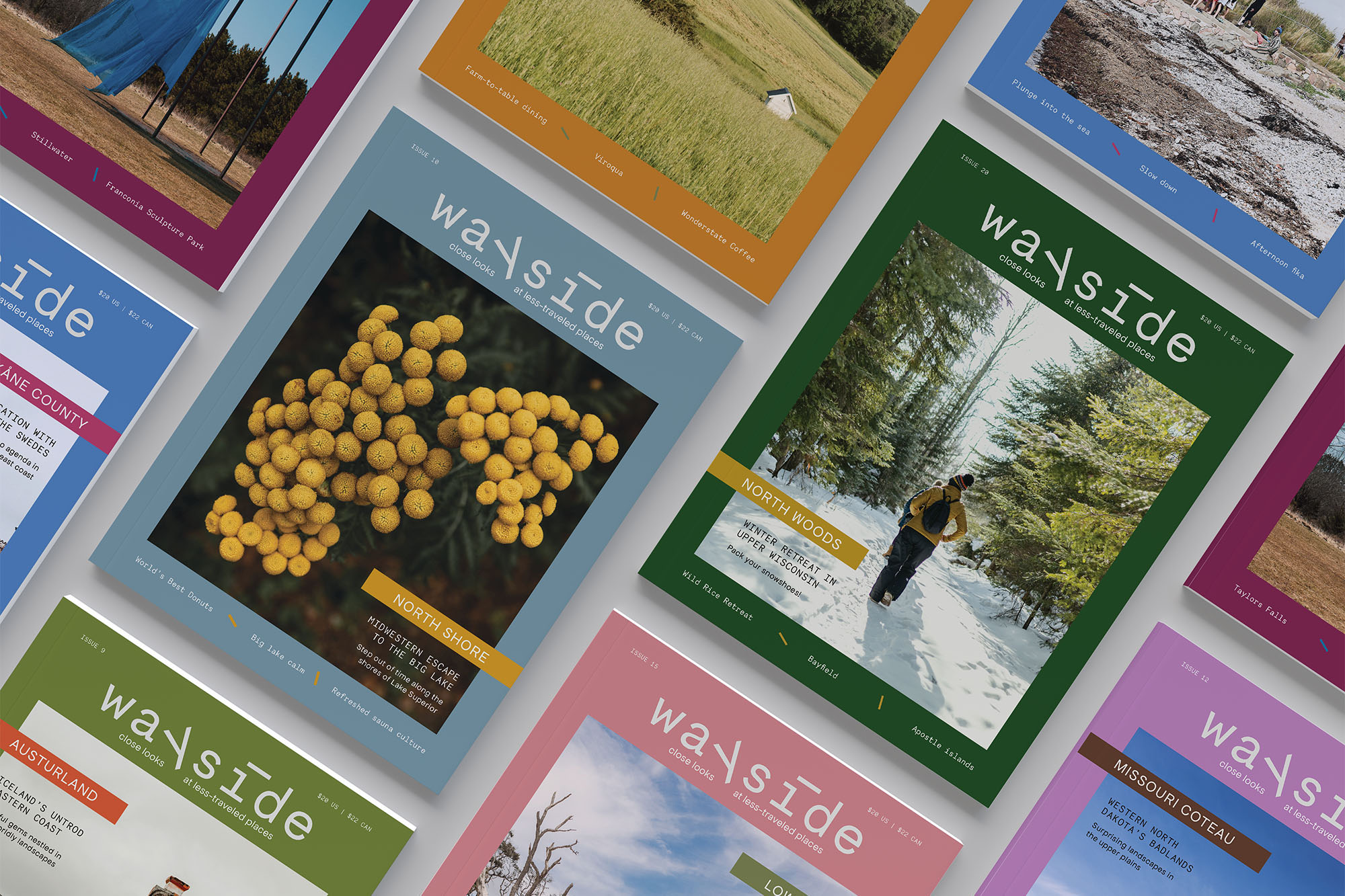
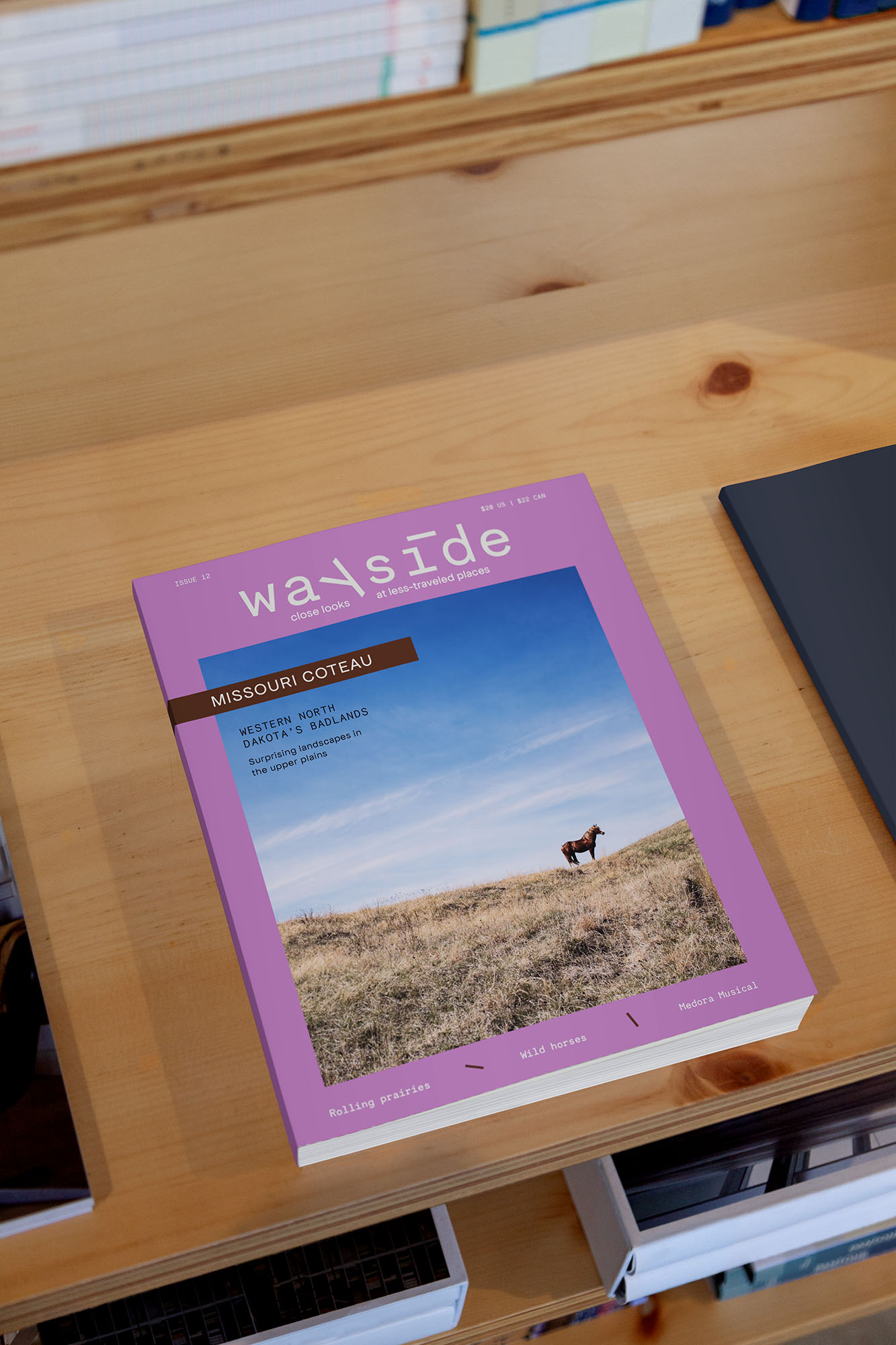
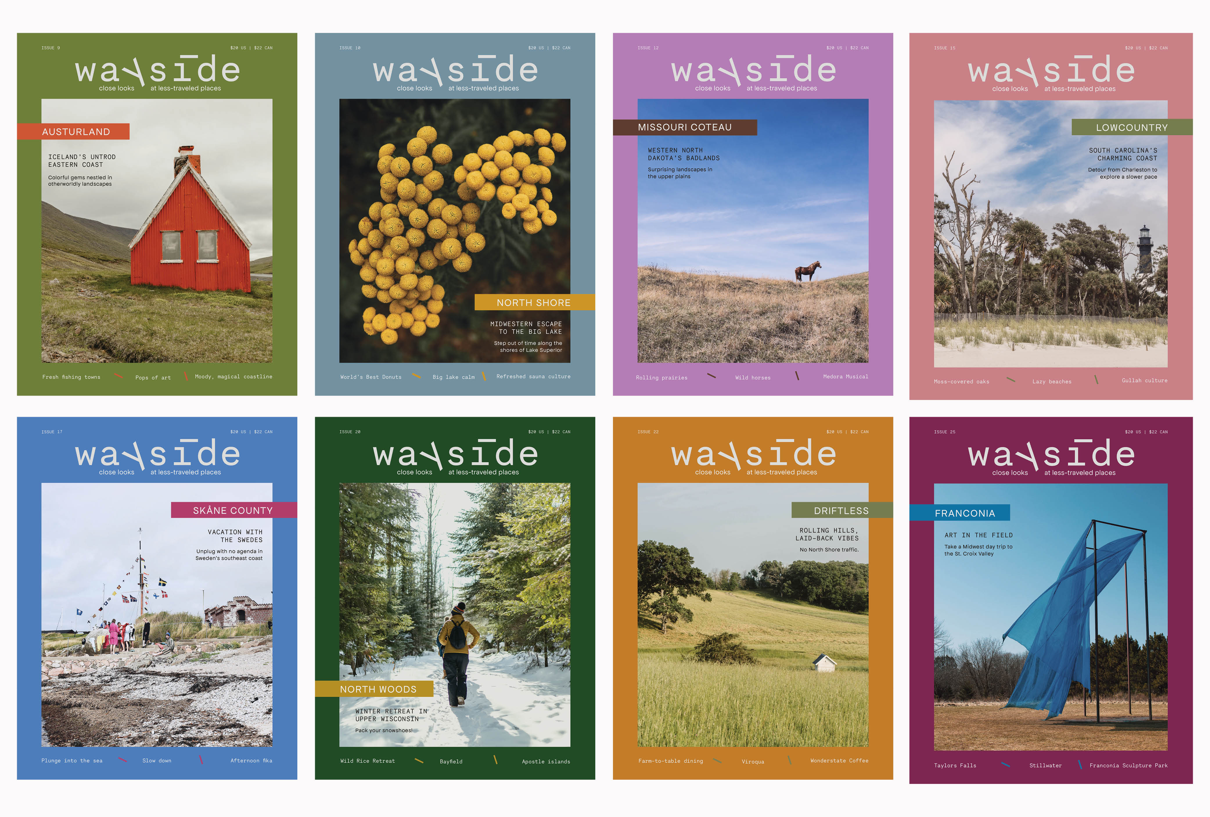
Cover System
Each cover calls out the featured geography in the accent color bar, lists three story teasers at the bottom, and includes the issue number and price in the header. The colors change, with the placement of the nameplate and the use of a single photo consistent every issue.
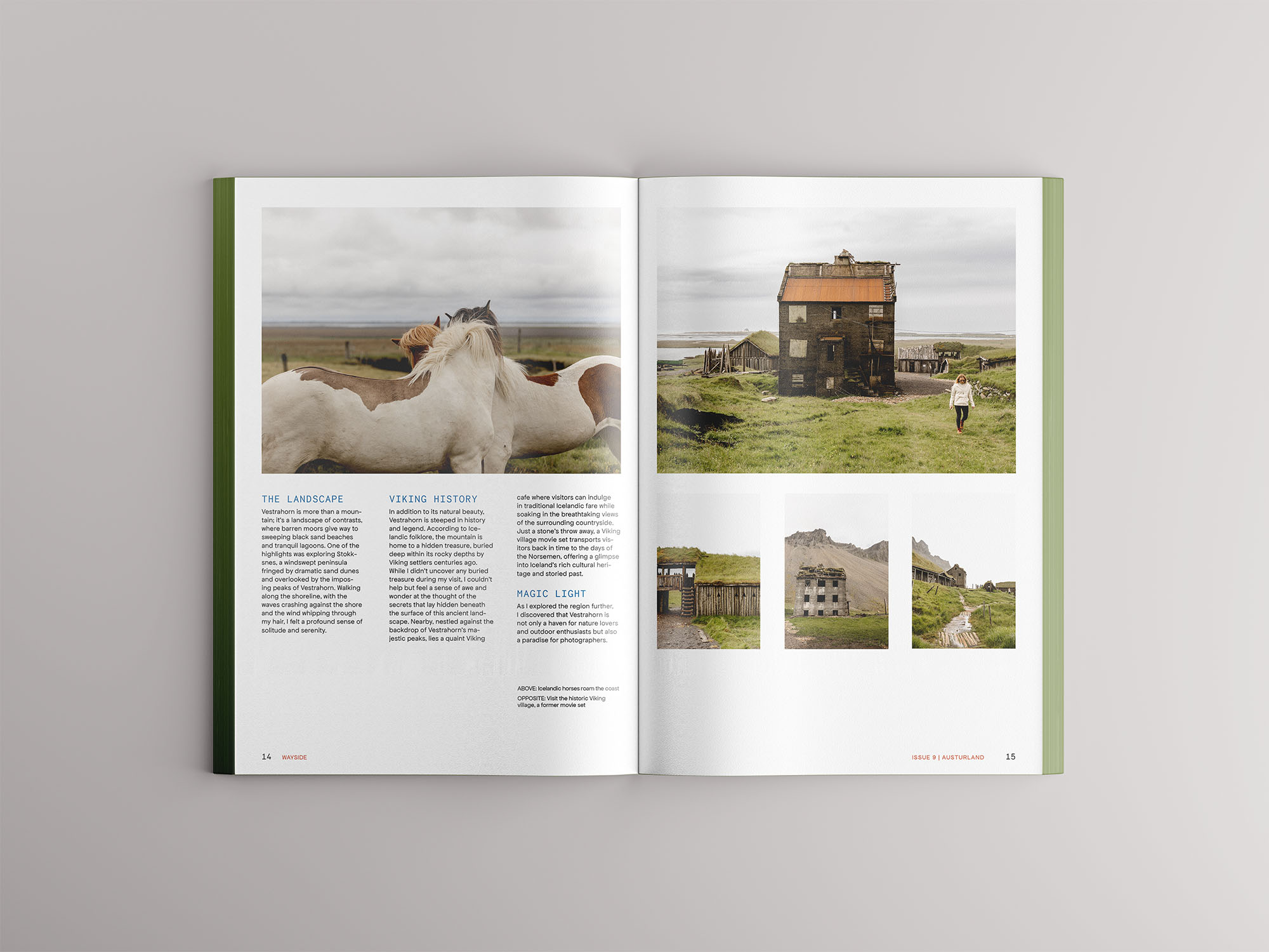
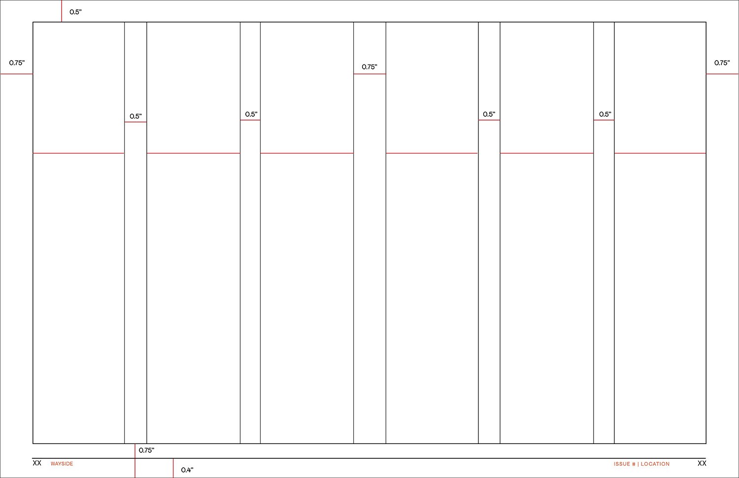
Grid
The interior layout system features a six-column spread, with the margins slightly wider than the gutters. The folio information lives at the bottom and outer corners of the spread. A full-width image can occasionally override these elements.
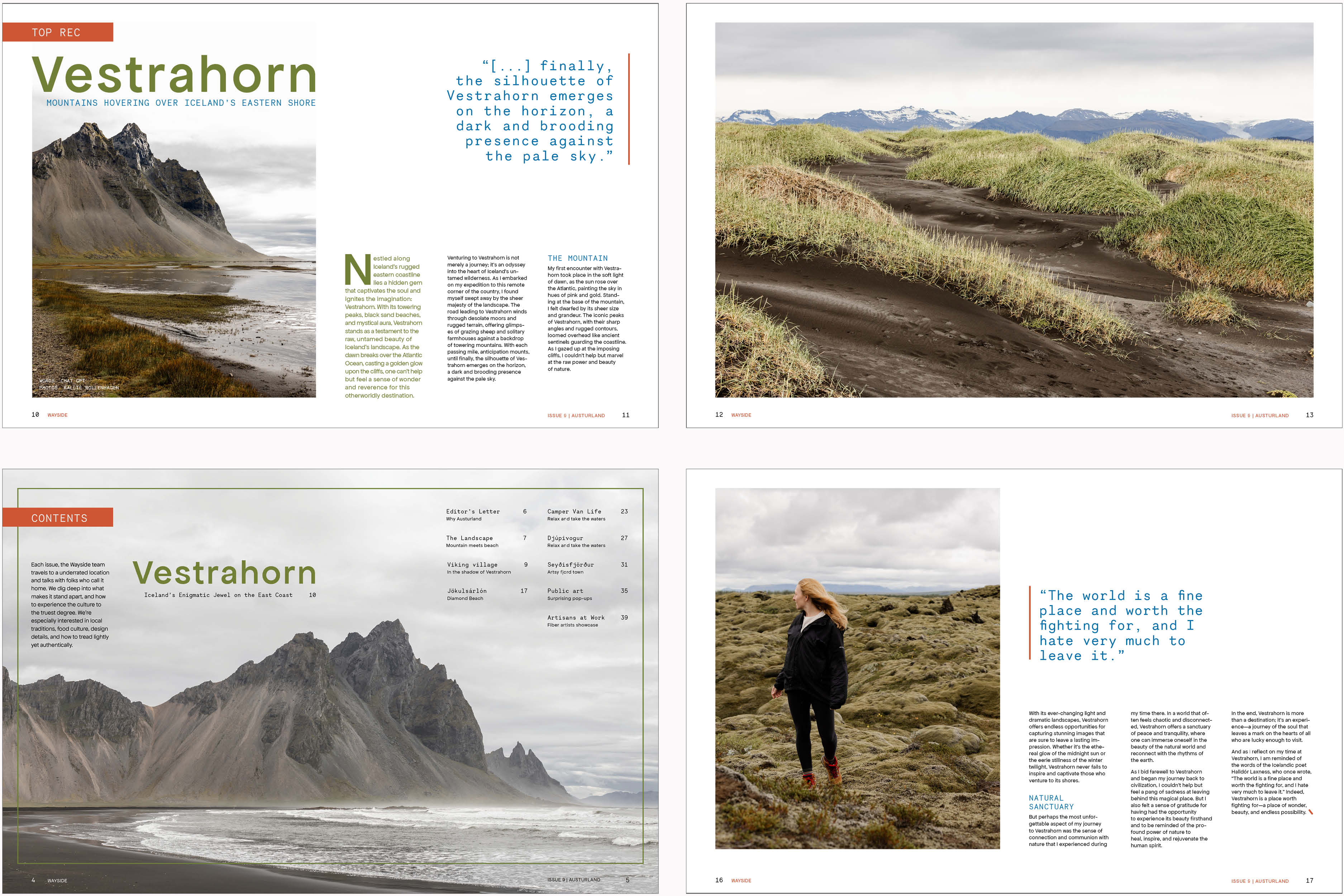
Spread Examples
The grid allows for a lot of flexible layouts. Each spread should be a good balance of imagery and text and white space, with full-bleed images used intermittently.
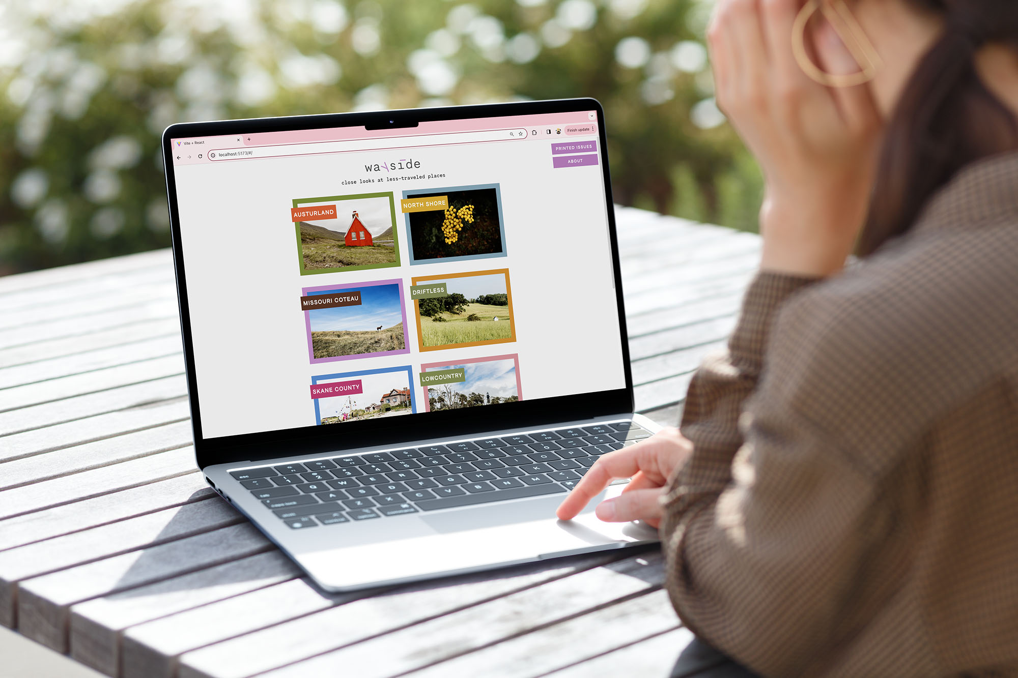
Wayside Website
Designed in React in Programming for Web. The challenge was to repeat the same visual elements — color banner, imagery, nameplate, and type — to create a site that gives teaser content for each Wayside issue, encouraging viewers to buy the magazine.